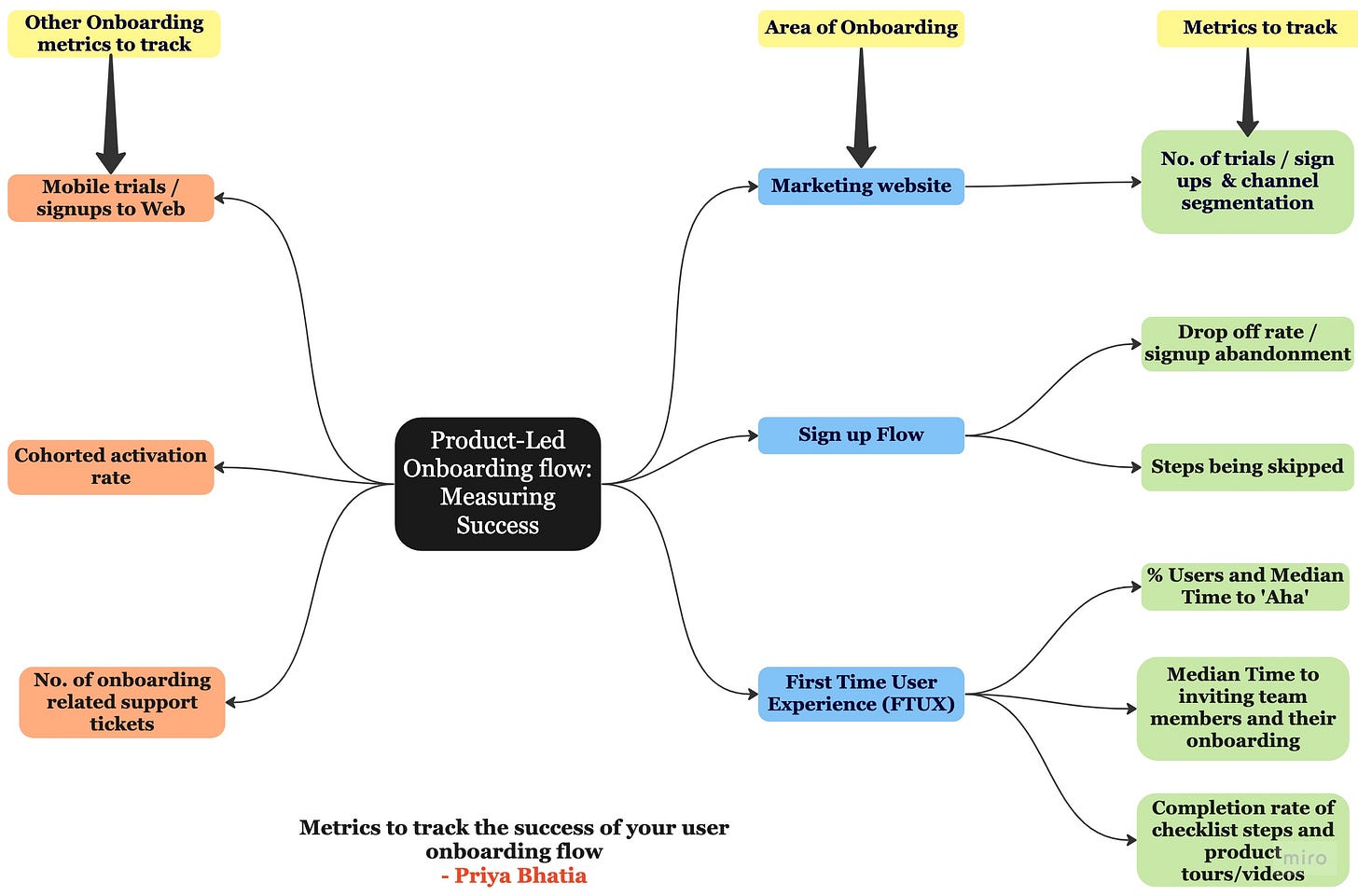
In a previous post, I discussed common tactics to improve user onboarding flow and how it ties into activation.
But how do you know which area of onboarding you need to improve? I use qualitative and quantitative product data to identify these areas of opportunity.
As a recap, your user onboarding starts from the marketing website, takes users through the signup flow, and gets them to their aha moment through various FTUX experiences. (Refer to this post to learn more).
So how do you measure the success of each step? Let’s find out:
Marketing website: No. of trials/signups
This arguably lies outside the purview of the product; however, successful onboarding starts from the marketing website. A healthy number of signups or trials started daily / weekly / monthly indicates that the product's value prop is adequately understood and warrants more investment in improving the downstream signup flow.
Segmenting onboarding performance by marketing channels helps in further refining the signup flow.
Metrics to track the signup flow.
Drop-off and abandonment rates:
This metric is the most low-hanging fruit in improving your onboarding flow. If users have signed up, there is a high likelihood that they are interested in your product. This metric indicates what percentage of users who signup get into the app. High dropoff or abandonment rates indicate friction in getting the user into the product. Start by tracking drop-off at each step and look into your Hotjar / Fullstory videos to identify what might be causing the drop-off. (Note: Drop-offs also occur if leads are unqualified, but you should target an onboarding completion rate of 45-65%. )
Users skipping steps:
You added smart defaults as a way of reducing friction. But what good are they if users do not engage with those steps? If you have a skip button on these steps, you want to measure what percentage of customers are skipping these steps. Qualitatively vetting might help with insights on whether the smart defaults add to the friction. User testing might also help understand the user psychology behind the skipped steps.
Metrics to track in the FTUX.
Median time to aha
Simply put, time to aha = time to value. This metric tracks how quickly the user is meeting the promised value. In a B2B tool, it is common for users to meet aha in multiple login sessions. However, reducing this time expedites user activation and conversion. Time to aha is tracked as the time to the first project created, time to the first video created or shared, whatever is the core value prop.
Time to invite a team member and time to their login and their onboarding
In B2B tools, the value realized increases as more users try the product. Therefore, these tools generally have a team invitation component. The lower the time to invite a secondary user and their onboarding, the quicker the feedback loop to the primary user, increasing the chances of activation.
Checklists and product videos bridge the gap to the user's aha moment.
Completion rate of checklist steps
If your product has an onboarding checklist, you want to measure the number of users who completed the different checklist steps as a % of users who onboarded. A low or partial completion rate indicates that the checklist steps are not easily understood or are too many to overwhelm a user, or a user cannot find it after dismissal.
Dismissal rate of videos or product tours.
Similar to the above, a product video or tour could hinder a user onboarding if triggered at the wrong time or is too long for a user’s attention span. Generally, on-demand product tours and videos perform better.
Other metrics to consider:
Overall activation
Remember that a superior onboarding flow activates users faster. You need to track a cohort activation rate to identify how new cohorts of users activate. Lower trending activation rates should be a signal to investigate your onboarding completion metrics outlined above. Read here for more about how to define your activation rate.
Mobile trials to web
This is often forgotten in B2B tools that are web-first. There is a section of users who may start a trial on their mobile devices. These tools require a user to explore the web version after mobile onboarding. The web version is where the actual value is realized and users pay for the conversion. Thus, optimizing the mobile-to-web hand-off needs to be tracked and measured.
Number of Support tickets
Another area to monitor for signals to improve onboarding is the number of support tickets related to onboarding. Generally, queries on company settings, adding additional team members, creating new projects, sharing projects, etc. indicate opportunities to improve the wizard.
If you liked this post, you might also like:
Let me know what did I miss by commenting below! If there are other topics you want me to cover, feel free to share.

